"The only constant thing in this universe is change."
Male
Game Designer
Finland
Joined on 3/8/08


- Level:
- 24
- Exp Points:
- 6,173 / 6,400
- Exp Rank:
- 7,838
- Vote Power:
- 6.58 votes
- Rank:
- Town Watch
- Global Rank:
- 54,576
- Blams:
- 56
- Saves:
- 93
- B/P Bonus:
- 2%
- Whistle:
- Normal
- Trophies:
- 25
- Medals:
- 460
- Supporter:
- 3y 6m 22d
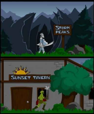
Environment screenshots
Comments
looks cool
thanks
wow.... I just played it and its really fun!!!!
and underated
Glad you liked The Rise of a Knight!
Hopefully you'll like the sequel too :)
The first was great, looking forward to the sequel! I really liked the first one.
Glad you liked the first one. The sequel will probably take quite a few more weeks, if not a month or more.
Looks really cool, great trees and flora artwork. But the text on the signs looks a bit cheesy, you should just use a font or no outline.
I kinda like the text on the signs. I guess it just comes down to personal taste. I did create that font myself, and it was my first try at that, so go figure, but still, I like it :)
You mentioned that I could use the same text but without outlines. That wont be really possible, because that same font appears in many other places in the game, and without an outline, it might be difficult to read with a lot of background elements in the back.
Well, Im glad you like the rest of the art!
Take your time to finish the sequel. Keep quality as priority.
Molkman's got a point there: the font is cool, but it's a bit out of place. You could try the same font, but with a brown color, brighter than the rest of the sign, and with darker outlines. Like carved on the wood.
I remember playing the first one. It was cool, the art is fine. But, personally, I did not like the gameplay, fighting system.
Anyway, I will check the sequel. Just don't speed things up, take the time to finish it as it deserves.
The problem with changing the color of the font is that I use that text in other places and situations in the game as well where brown would be hard to see. Part of the reason why I made that font was to make a certain text that would be clearly visible in most places. Sorry if the font irritates, but it has its reasons. I'll play around with the color a bit and see if I can come up with something better, but like I said, I like the blue color and the style as well, sorry.
The fighting system will only be slightly different than in The Rise of a Knight, but there will be a lot of improvements with flaws and glitches like hit detection and so on. However, THERE WILL BE A LOT MORE WAYS TO KILL YOUR ENEMIES, and that is something Im not going to elaborate on right now.
I'll try not to rush things too much, but I do have a deadline. Art is never finnished, its just abandoned. I could work on this game forever with the engine I built if I had the time. Okay, enough of my rant, thanks for the comments!
EDIT: I just tried a brown color for the font, brighter than the rest of the sign just like you said, and it looks pretty cool! I might use it seeing as 2 of the people who have commented here have mentioned that they have a problem with the original color. The only thing is that the same font is at many places in the game, not just on signs, so when I change the color of the font on the signs, they automatically change everywhere else, but luckily the new color looks pretty cool in most places.
Thanks for the advice, much appreciated!
Nice graphics
thanks :)
I like the backround designs. They kept me playing your first game until the end and hopefully will do the same for the second. :D
Thanks for your review of The Rise of a Knight. Im glad you came here to check out the screens for the sequel. If you liked The Rise of a Knight, you are sure to love its sequel. Its just... well, more.
good to see someone using the frontpage to post something actually productive.
the are looks about the same, but still is very nice. do you plan to address all the issues brought up in the reviews?
Yeah I plan to address as many issues as I can. I have improved on most issues already and also thrown many new things into the mix.
looks cool
thanks :)
FatalReactions
First Comment WHEW
and cool BTW
SeethingSwarm
Congrats on the first comment thing.
And thanks.